My current client asked me to conduct usability reviews into two of its systems:
- The first, an online portal used by its customers;
- The second, a similar online portal used by its business parters.
The two portals (which I did not help to build) are similar in function. The two user groups use the portals to perform similar activities.
Both contain clickable progress bars, not too dissimilar to the following (though in this case this is just a mockup – not actually clickable):
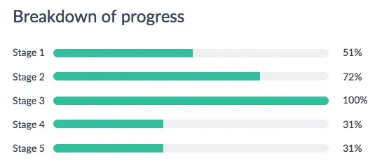
The progress bars link to a more detailed breakdown of information.
I conducted a separate a round of usability tests for each portal. Partly in person, partly online, but in all cases moderated and with the classic usability testing poker face.
The results were surprising. Customers (portal 1) invariably understood that clicking the progress bars would reveal more detailed information. Partners (portal 2), on the other hand, almost invariably did not.
Why the discrepancy?
It’s impossible to know for sure, but in my view it’s to do with context.
Though similar on the whole, there are subtle differences in the layouts and priorities of the two portals. For customers (portal 1), the progress bars have prime position, with a similar clickable bar on the home page. Very little of interest can be discovered if not via the bars. For partners (portal 2), the clickable bars are in a sub-section, not on the home page, and not such a critical part of the system.
This is also to do with consistency (such a critical element of interface design): because most links in the partner portal are text-based, it takes a leap of faith, rather than an intuitive understanding, to twig that these graphical bars link to further pages.
As a result, partners do not intuitively understand that the bars are clickable.
Low cost solution
Knowing that partners (portal 2) struggle with the bars, and not wanting to risk the same with even a minority of customers (portal 1), my solution was to add a text link next to the bars, much like the following:
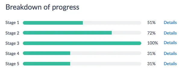
Users intuitively understand that clicking the link will reveal further details. (Hover effects aren’t enough: the user may not think to hover over the bars, and they are inadequate for tablets and mobiles.)
It was a simple, low cost solution; i.e. easy to implement without causing disruption or complication to the interface.
Simple solution aside, for me this is a demonstration that different user groups can provide significantly different results based purely on context and consistency.
From here, it’s no big leap to see why it’s so important to continue to test assumptions through regular usability tests. So the bars are obviously clickable to customers right now, but what if the portal grows and the context changes? It could make all the difference between something perfectly intuitive and something frustratingly not.