I digress from the usual topic of UX to share some lessons from my recent foray into design for print, which was challenging, rewarding and fun.
I was given the challenge of taking an agency’s creative vision and using it as the basis for designing Kings Court Trust’s printed materials.
Designing for print is not something I had done to this scale before. I knew enough to know that there was much I didn’t know; particularly, about getting the best colours on paper – one of the most important, and bewildering, parts of the process.
For anyone dipping a toe into the the world of print, here are the lessons I wish I knew before I started.
1. RGB vs CMYK
RGB and CMYK are two colour models; effectively, two different ways of displaying colours. A bit like paint ranges.
Most professional printing presses are based on CMYK. So, if you haven’t got your head around colour models well before the first print run arrives on your desk, you could be in for a nasty surprise – regardless of how stunning it looked on screen.
This video is an excellent introduction to CMYK and RGB:
Here’s some of the nitty gritty, much of it specific to the latest Adobe CC suite (apologies if you don’t use it):
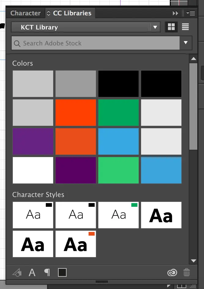
- I find it helps to create a swatch library with both RGB and CMYK colours, using the Adobe CC colour picker. Above is a screenshot of my swatches: the differences between RGB and CMYK variations are particularly marked in the oranges and greens.
- Determining the right colours in the first place is more difficult. If you use a designer, ask for CMYK, RGB and hex equivalents for every colour. In our case, we had tremendous difficulty translating our green from RGB to CMYK… turns out green in particular is a pain in the arse when it comes to CMYK. But after experimenting and having a few test runs, we got the right one.
- In InDesign (or equivalent), make sure the ‘transparency blend space’ is RGB or CMYK as appropriate – the wrong one can produce some odd results.
- Don’t bother converting RGB imagery to CMYK (or vice versa) before importing – this is a myth. If your export settings are set up properly, this will do the conversion for you. (Though it’s not so simple for text…)
- Create an RGB version of the document for downloading, emailing and printing at home/office – on screen, these colours tend to look more vibrant than CMYK. Create a CMYK version with all the trimmings (bleed, printer marks etc) for professional printing, though check with your printer first for the best settings.
How to check if a file is CMYK or RGB
It can be helpful to do a final check of a file before it’s sent to print.
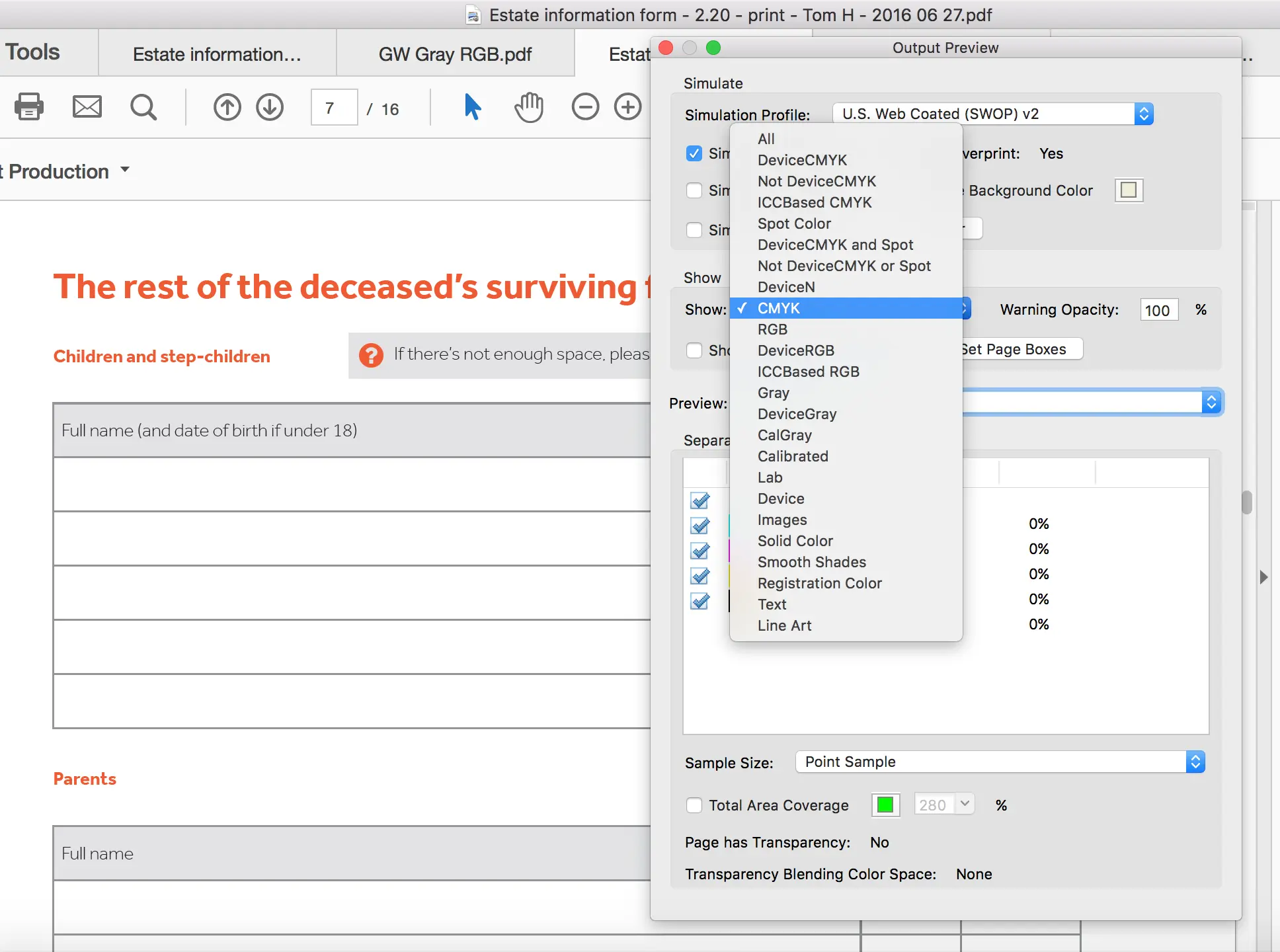
If you’re lucky enough to have the very handy Adobe Acrobat Pro DC and you want to check a file’s colour model, open ‘Tools’, ‘Print production’, then ‘Output preview‘. Under ‘Show’, select ‘CMYK’ – if all the elements on the page (apart from printer marks) remain visible, it’s CMYK. Then select ‘RGB’ – if it’s CMYK, all elements will disappear.
 Above – the output preview in Acrobat showing anything CMYK. The page elements remain visible so they must be CMYK.
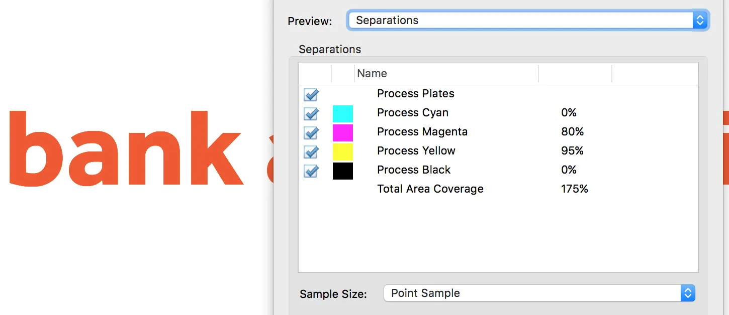
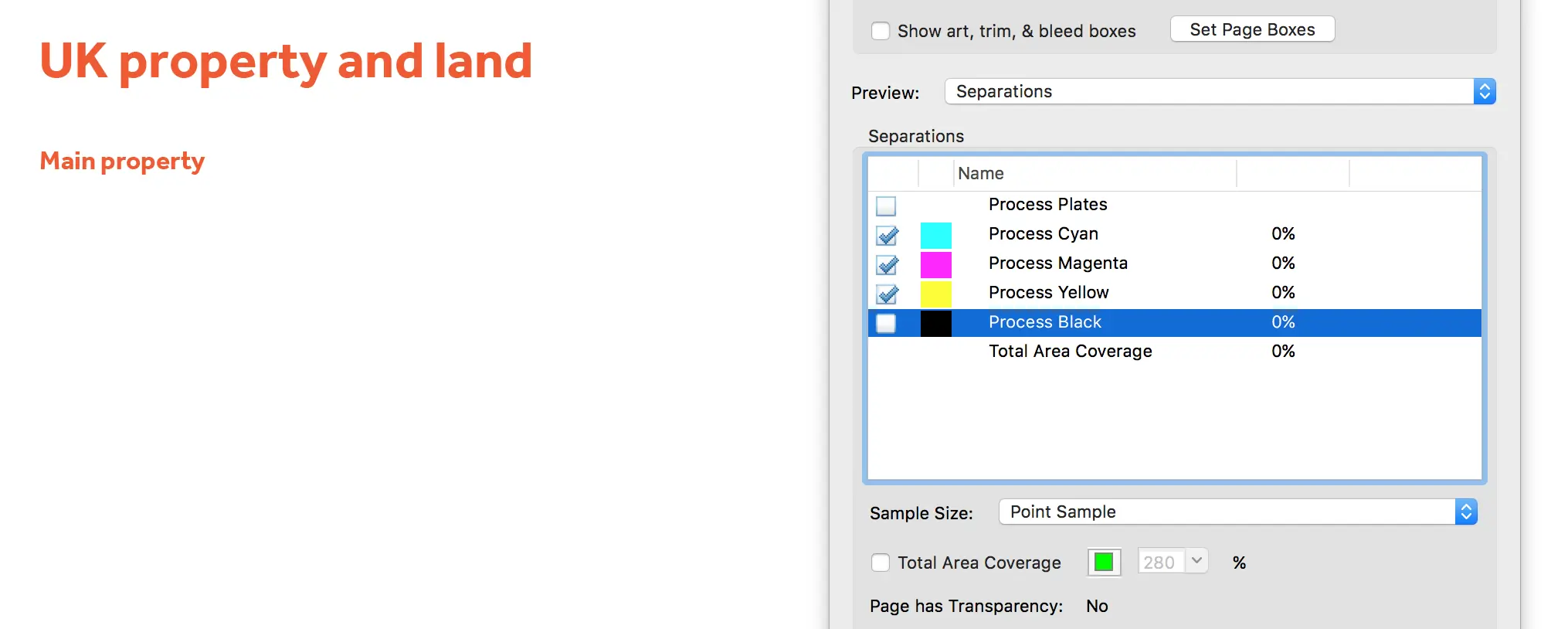
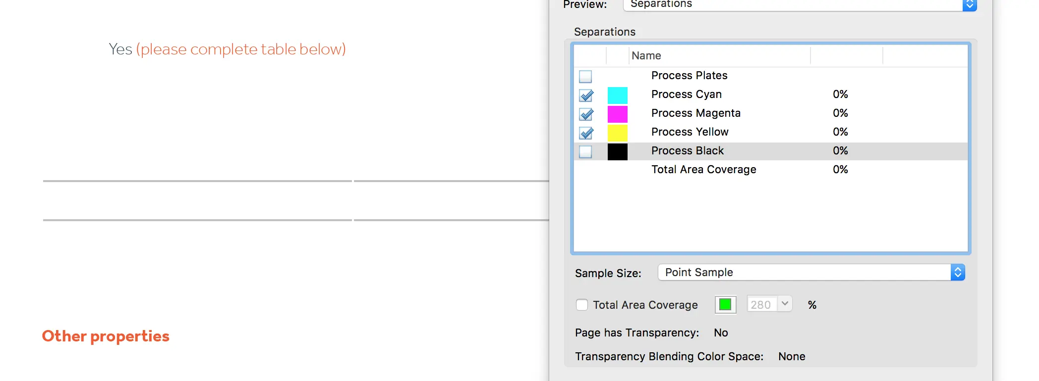
Also in ‘Output preview’, if you select ‘Preview’ > ‘Separations’, you can hover the cursor over an element on the page to see a breakdown of the CMYK values. Particularly helpful to check for four-colour blacks (see below).
 Above – hovering the cursor (not shown) over a colour in output preview will show the four CMYK values
2. Black’s not necessarily black
Something that looks black on screen might not appear black in print.
To achieve blacker blacks and greyer greys, conventional wisdom is to avoid “four colour blacks”. That’s a black or grey made up of four CMYK values, e.g. C75 M67 Y67 K89. Instead, it’s often best to ensure blacks have a “K” value alone – e.g. C0 M0 Y0 K100.
Setting up the right swatches in your software is a great start. I use C0 M0 Y0 K12 for a light grey, C0 M0 Y0 K30 for a mid grey and C0 M0 Y0 K50 for a slightly darker grey.
If you use Indesign, under ‘Preferences’ and ‘Appearance of blacks’, make sure ‘Printing / Exporting’ is set to ‘Output all blacks accurately’.
Getting the right export settings (below) is also crucial.
How to identify four-colour and one-colour blacks
It’s often helpful to check the blacks in a file after export. Using Adobe Acrobat Pro DC, under tools, choose ‘Print production’ and then ‘Output preview’. Select a CMYK profile from ‘Simulation profile’, e.g. Coated FOGRA39. In the preview section, select ‘Separations’. If you untick ‘Process Black’, all one-colour blacks will be removed, and all four-colour blacks will remain.
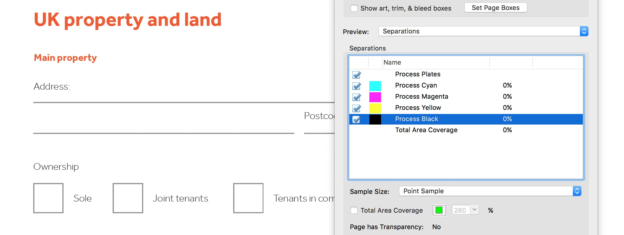
1. Above – Acrobat Pro output preview showing all four parts of CMYK, so every element on the page is visible.
2. Above – ‘Process Black’ has been unticked, so all genuine one colour blacks disappear (only elements made up of cyan, magenta and yellow remain, like the orange headings).
3. Above – Oops… on this page, some cheeky grey lines remain, which means they can’t be one-colour. This needs fixing, so it’s back to the original document to sort it out.
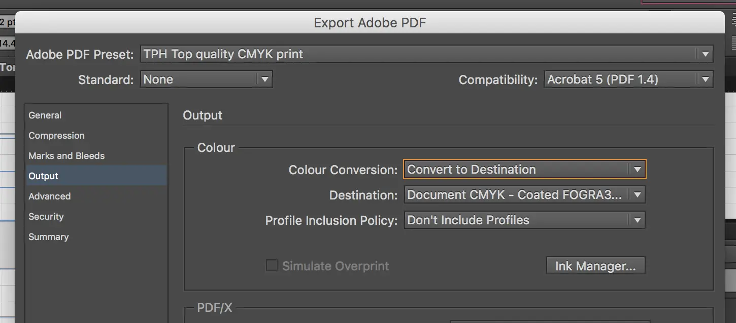
3. The right software, the right export settings
For brochures and other documents, I use Adobe Indesign CC. In terms of colours, ‘Output’ is an important part of the ‘Export’ settings. To ensure a document exports as CMYK: for ‘Color conversion’ select ‘Convert to destination’; for destination I use ‘Document CMYK’ (which takes the current working space from the document settings, which for me is ‘Coated FOGRA39 (ISO 12646-2:2004)’); for ‘Profile inclusion policy’ I use ‘Don’t include profiles’.
4. Find a friendly printer
A good relationship with your print professional helps enormously – they can identify problems and suggest solutions before the print run.
This is just the tip of the iceberg. There’s paper stock, finish, bleed, trim, slug, litho vs digital (for more information on litho vs digital, check out this video and others from the same channel), etc etc. But achieving the right colours and blacks is a great place to start.