Problem
A couple of days after taking a Thriva blood test, customers see their results on the Thriva app. We had insights from customers about the experience, including:
- Difficulty finding information about a result — customers sometimes missed helpful clinical guidance
- Difficulty navigating to a particular result — the results page is quite long, with up to 14 different test profiles
- App activity dropped off significantly 20 days after download — how could we make it more useful for customers long after their test results?
- Difficulty understand the next steps after a failed test
- Difficulty interpreting colours, particularly for colourblind users
Above all, there was an unclear “so, what next?” after receiving results.
This impacted retention rate – specifically, the percentage of customers who’ve had their 1st test and go on to buy a 2nd.
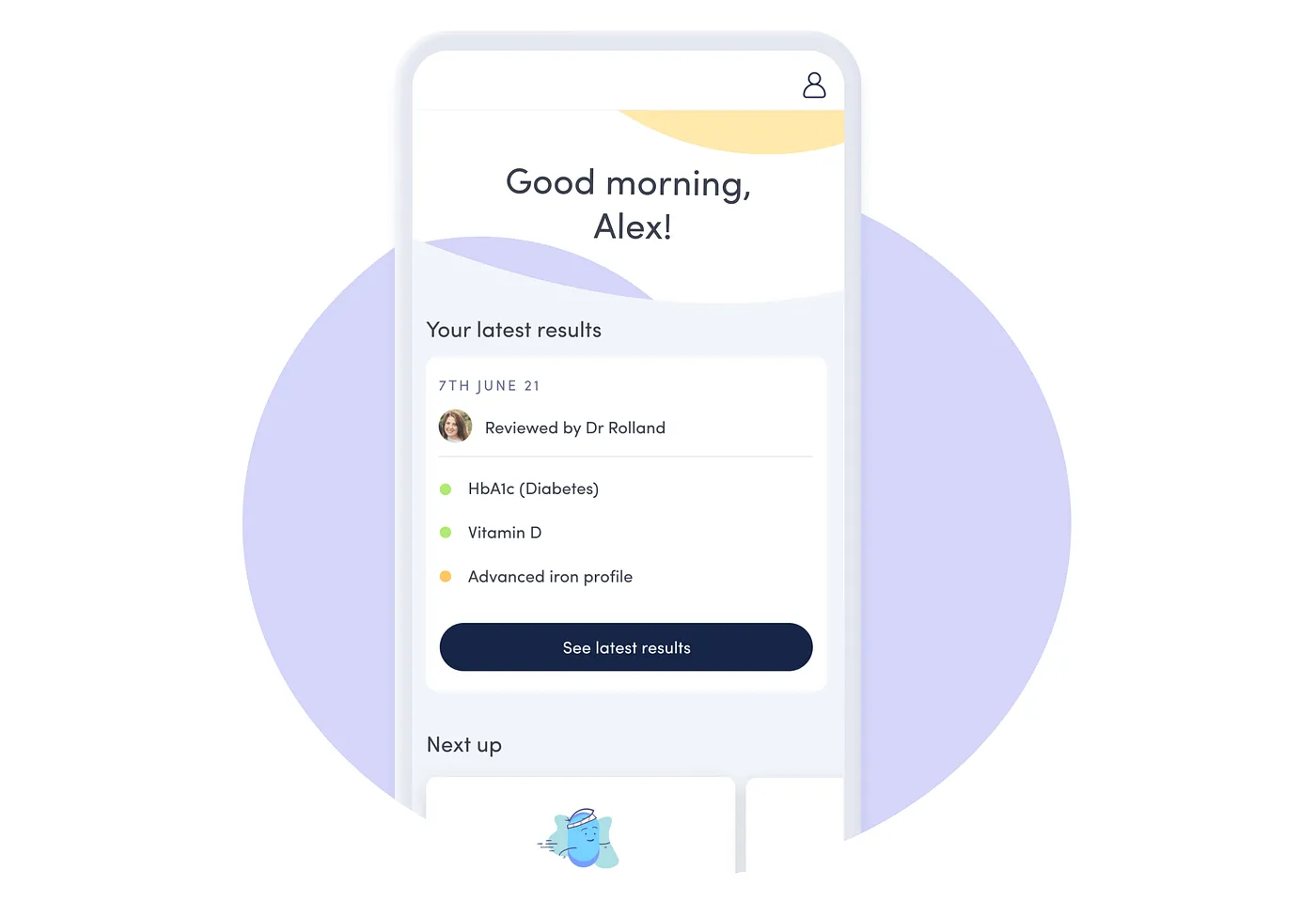
 Above: the Thriva app before this project
We had another business problem to consider — our app’s results page was a ‘web view’. We needed to rebuild it natively, to make it more flexible and scalable and improve the experience for users. This was a good moment to make the change – usage of Thriva’s app was increasing, with 57% of new Thriva users viewing their results in the app.
With these business and user needs in mind, we framed our design challenge:
How Might We simplify the journey to and within the results page, with clearer actions for T1 users?
(T1 is Thriva jargon for customers who’ve bought 1 test.)
Project
This was our ‘Native app results experience’ project, July to Sep 2022. It lasted 10 weeks from kick-off to launch.
Team
Me – Design lead / project lead, working as part of a cross-functional team including: Alexis (PM who joined half way through the project), Seth (Tech Lead), Aish and Kirstie (mobile engineers), Suse (FE engineer), Noel and Macarena (Clinical stakeholders), Becky (user research), Andrea (content design).
Process
Kick off
I hosted a kick off workshop with the whole team. We reviewed the insights and shared our hopes and fears for the next steps. It helped build a shared understanding of the problem space, hone in on scope and bring a diverse range of opinions to the table.


Measuring success
We agreed on three metrics:
- % T1 customers who purchase supplements within 7 days of results
- % T1 customers who update next package within 7 days of results
- % T1 customers who cancel within 7 days of results
We’d also track:
- retention rate, which would be our north star metric. However, we knew retention could only be measured over a long term, and was impacted by many things.
- app load times, which the engineers used one of their measures for success
Journey mapping and insights
Having gathered our insights and framed our challenge, we dug deeper.
We reviewed the current user journey…

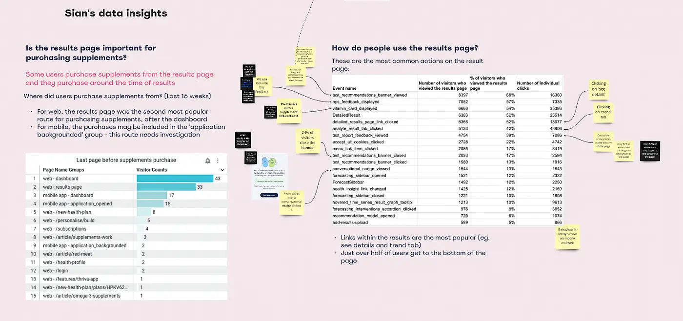
We delved into the data…

We came up with around 40 problem statements and grouped them by impact and effort. We emerged with an achievably concise list of challenges to tackle.

I also hosted a competitor teardown. I invited people across Thriva who’d used our competitor’s (or similar) products to share their experiences. I created a Miro with screenshots and journeys for a dozen or so products – it endured beyond this project and became an important tool for product teams.
Ideation
I ran a group sketching session. Noel and Macarena — doctors in Thriva’s Clinical team — were among the sketchers. Noel had an idea about combining results charts which I loved, and became a key part of our solution. Seth, our tech lead, shared an idea about the way we order the page and bring the most important information up top.

Everyone seems to love sketching sessions — it’s fun and mindful to be creative. As a designer, I value the output of these sessions as a jumping off point for wireframing.
Wireframing
One design challenge was simplifying the routes to clinical recommendations, clarifying the language and surfacing the most helpful information at the right time. I worked closely with Andrea, our content designer, and our Clinical team.
The image below shows some early content— for example, the ‘How to improve your iron (ferritin) levels’ boxes on the left and the ‘How total iron-binding capacity affects your health, and how to improve it’ on the right.

Andrea and I went through a number of iterations. In a later design (below), the box on the left said ‘Take action’, and the link on the right was ‘Understand your result’. In testing, users found these easier to read, easier to interpret, and less likely to miss.

Results summary UI
One aspect of the UI we wanted to improve was the results summary. For example, because users – colourblind users in particular – struggled to interpret the colours. In the image below, the screenshot on the left is the existing results summary. On the right is a simulation of how a colourblind user might see it, with dulled, relatively indistinguishable colours.
 Left: results summary. Right: results summary simulated for a type of colourblindness. This comparison is only helpful for non-colourblind readers of this case study – apologies to others.
Something I experimented with, but ultimately rejected, was a colourful summary donut chart (early greyscale explorations shown below) — we all loved it, but when we tested it with users, they found it tricky to use, and it was hard to make accessible.

Testing with users
Becky and I ran two rounds of evaluative testing. The first was on usertesting.com, testing aspects of usability with non-customers. The second was with customers — moderated interviews to dig more deeply into the designs from the perspective of Thriva users. For each round, Becky and I worked together to prepare a prototype and script.
 Above – a moderated user test with a Thriva customer
I co-hosted the sessions and incorporated insights from the research into the next design pass.
Working transparently, gathering feedback
As well as testing externally, I was continually sharing progress in our our weekly design crit — when members of Thriva’s design team come together to share work and seek feedback.

I also worked very closely with engineers. We had dedicated time in design reviews and tech planning to dig into the designs in more detail and gather feedback. Shout out to Aish, one of our mobile engineers, for keeping me on the straight and narrow with accordions 🙌

Outcomes
We lauched the new version of the app on time, on 15 Sep – 10 weeks after kick-off. We’d achieved a key goal – to rebuild the app natively.
In terms of metrics, the most encouraging outcome was a roughly 30% drop in cancellations within 7 days of results over the 3 months after launch. This is a proxy metric which impacts retention rate, our north star.
We also tracked supplement purchases from the app, which increased around 25% after launch.
We tracked retention rate, though, as expected, trends can only be assessed over the long term, and are impacted by many things – it was hard to attribute to the changes we made during this project.

Reflections
- We stuck to time and scope and rebuilt the app natively, with significant usability and accessibility improvements.
- Although outcomes were positive, the impact on our north star metric – retention rate – was inconclusive. Which raises the question, could we have used those 10 weeks to make a more tangible impact?
- However, the project was an important foundational step for further retention work – even before launch, we’d kicked off another project, again with retention rate as its north star metric.
- I look back very fondly on this project – we were a good team, collaborating really well and moving quickly. One thing I particularly enjoyed was collaborating with engineers on the app UI.
For a different angle on this project, particularly how the different memebers of Thriva’s CRD team worked together, see my post on Medium from Aug 20222.
