Reducing case time from 19 to 6 days with smart operations tooling
A complex zero-to-one project which reduced a key aspect of case time from 19 to 6 days. 2020.
FAREWILL
B2C Series B lawtech startup, London
Product
Internal tooling for teams collecting data after a death
My role
Hands on design and research, project co-lead
Team
Product squad (8 people) + operations/legal experts
Problem and strategic context
Our scaling service had a bottleneck – collecting detailed, resuable data from families after a death
A few months previously, I was part of the core team that launched Farewill's 0 → 1 probate service. We took a scrappy, MVP approach, including using spreadsheets to collect customer data.
Now, the strategic context had changed. Farewill – which built disruptive, scalable services to deal with death – found its new probate service scaling fast. That led to a bottleneck – the process of collecting detailed information from families after a death. That bottleneck was beginning to slow growth, frustrate teams, and risk the customer experience.
Farewill's operations and legal teams needed to collect this data over the phone, in such a way that the data could be easily re-used. Our challenge was to help them do so efficiently, accurately, and at scale.
CHALLENGE QUESTION
How might we build internal tools to help our team gather information efficiently and simply from customers over the phone?
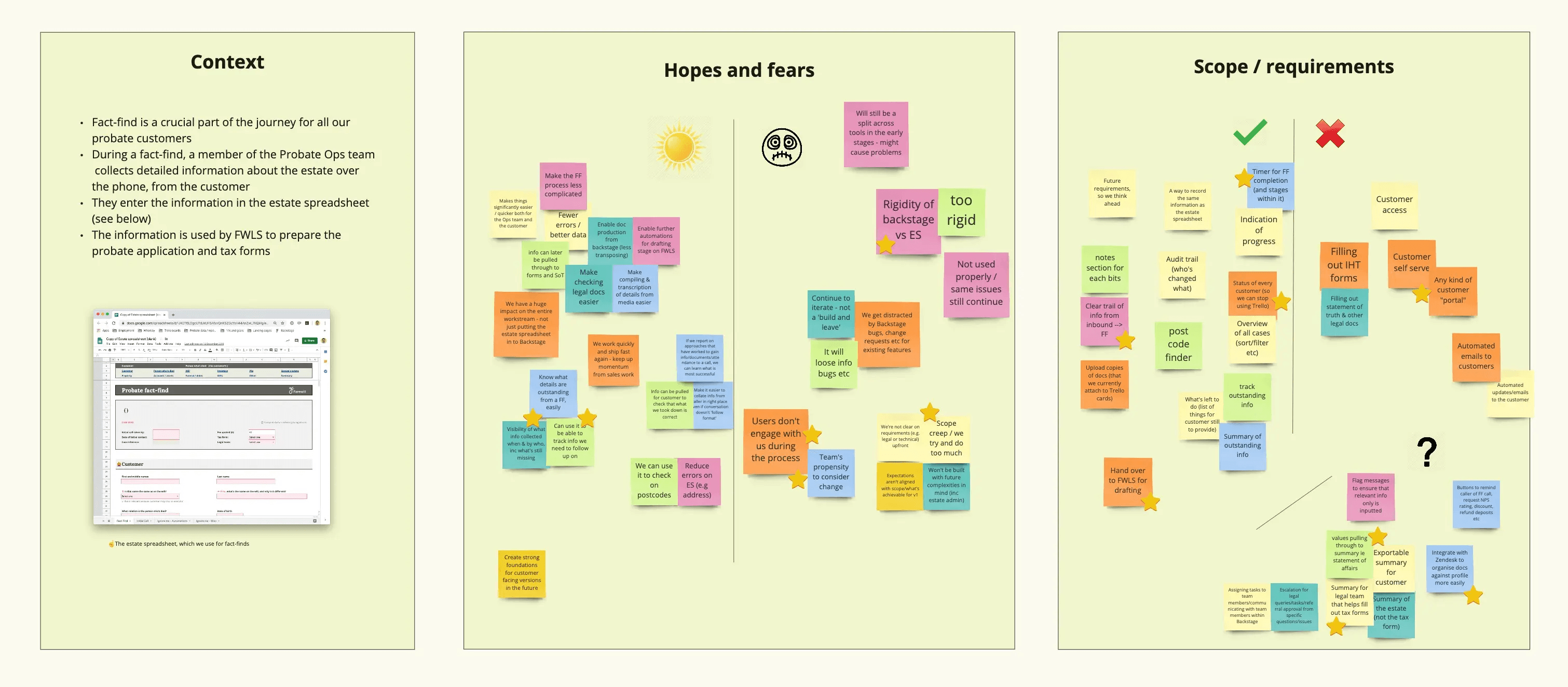
KICK-OFF
Setting the team up to succeed
I played a leading role in the project. Early on, I ran a kick-off workshop with users and stakeholders from across the business. Bringing everyone together early was crucial – this was a cross-team tool touching operations, legal and product.
The kick-off helped to surface hopes, fears, problems and scope. It helped us gather a wide range of perspectives, uncover problems and help bring the team along on the journey.
One member of the team worried that by replacing spreadsheets with a digital product, they would lose flexibility.
I fear it will be too rigid. Spreadsheets are messy but flexible - e.g. we can add a note anywhere. That's useful because can get a lot of info thrown at us from customers.
— a team member
This kind of insight shaped early design principles and helped us focus on making the tool feel adaptable and flexible.
DISCOVERY
Understanding the context of use
We weren’t working from a blank slate. For several months, the probate team had been using a Google Sheet I’d designed to collect customer information. It was, in effect, our first prototype.
I spent extra time with the team, watching them use the spreadsheet, listening in on customer calls, and seeing how they took the data from the spreadsheet to progress probate cases in our case management system.
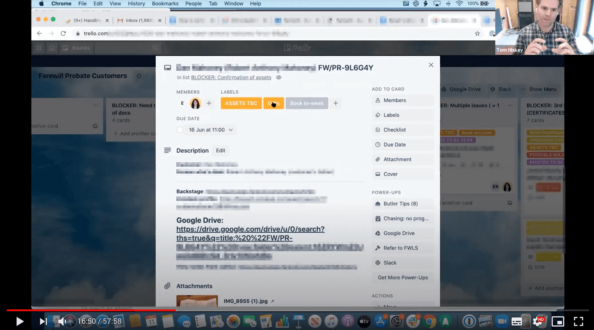
We learned a lot from these sessions. For example, the team frequently 'broke' the structure of the spreadsheet to add custom comments. And how customer calls rarely followed a set pattern, and how difficult it was to navigate the spreadsheet in those moments. These insights shaped the level of flexibility and the navigation patterns I designed into the final product.
FLOWS
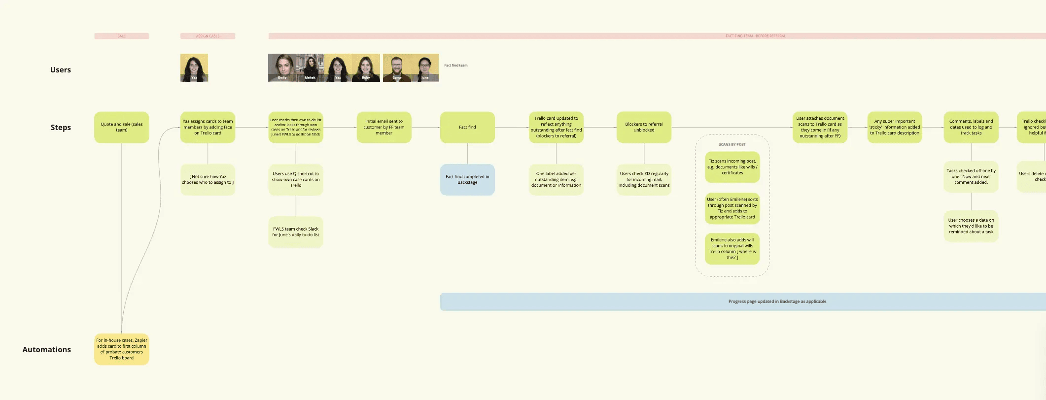
Developing flows and understanding the journey
Working closely with operations and engineering, I mapped the end-to-end flow – from the first customer call to referral to our legal partner – so we could align on what success looked like.
This helped uncover gaps between what the team recorded and what our legal partners needed – shaping how we structured the data fields and the customer journey.
IDEATION
Collaboration and critique
Part of working transparently and openly is bringing early-stage designs to our weekly design crit – a safe environment for feedback from the design team. I’d helped set up the crit at Farewill.
Feedback from one session focused on navigation and how users would understand progress and completion – a really important part of the experience. Specific comments included:
The way users marked sections as complete felt confusing and could be simplified
The floating to-do list at the bottom of the viewport made it awkward to follow progress
That feedback shaped my next iteration. I simplified the completion states and repositioned the progress window.

TESTING
I continued to test and work in the open
Internal tooling has a short feedback loop – the users are in the building and usually keen to engage. I took full advantage, running multiple user tests and interviews alongside our PM, James. We also encouraged comments directly in Figma (see below).
Observations from testing included:
Missing sections, such as money owed to the person who died (e.g. a council tax refund)
Technical, unfriendly validation messages when entering numbers
Opportunities to simplify conditional logic – for example, only asking about non-state pensions if relevant
I refined the design accordingly, adding missing categories, improving conditional flows, and writing clearer error messages – then re-tested with the team.
UI
Developing micro-interactions for our design system
The context called for a few additions to our design system. One was an input with a floating label – a label shown within the input that moves on focus to make space for the text.
Normally I prefer explicit labels, but with so many inputs on each page, space was paramount. Using floating labels saved considerable space, reduced page length, and improved readability without sacrificing clarity. Importantly for accessibility, the label remained visible after the field gained focus.
We added this and similar micro-interactions back into the shared design system to maintain consistency across internal tools.

DELIVERY
Working closely with our engineers
I worked alongside our engineers from the earliest stages of discovery, not least with our brilliant front-end engineer, Emily, to develop the new design system components.
Rather than a traditional handoff, we collaborated in short cycles – pairing on interactions and reviewing prototypes together. This close collaboration meant design and code evolved together – keeping quality high and moving quickly.
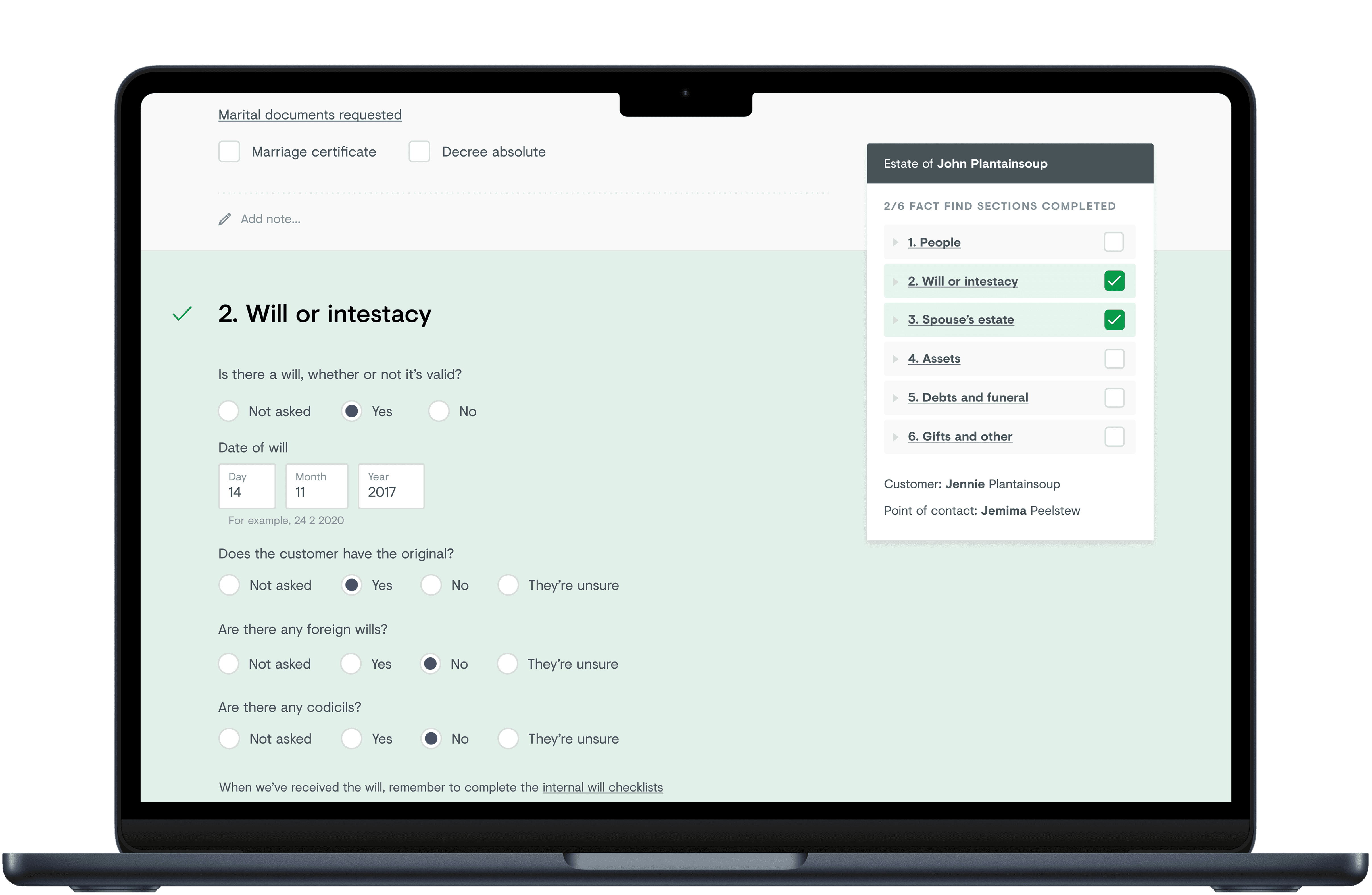
FINAL UI
Designing the final experience
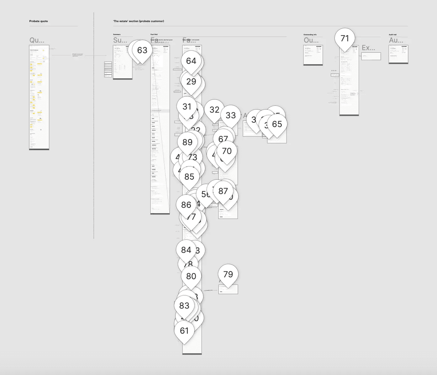
The final design focused on making complex data entry feel lightweight, flexible and reliable during long customer calls.
We added floating navigation so users could jump easily between sections – crucial because conversations rarely followed a strict order.
For repeatable items like assets, I introduced a card pattern with progressive disclosure, allowing users to add as many items as needed while keeping the layout compact and readable.
We used notes sections at regular intervals to replicate the flexible feel of adding notes in a spreadsheet.
Finally, a clear visual indication of progress helped the team move smoothly through calls, see what was missing and finalise data with confidence.
Together, these details made the tool feel approachable yet robust – helping the team work faster and more accurately.
OUTCOMES
Reducing case time from 19 to 6 days, removing a key bottleneck to scale
The impact was felt immediately – both by customers and the team.
We measured the average time from the initial fact-find call to referral to our legal partners – a key metric for both customers and the business. Before the project it was 19 days; after launch, it dropped to just over 6.
This reduction meant families received support faster, improving satisfaction, and our operations team could handle a growing caseload without adding pressure.
It enabled our probate service to scale faster.
Feedback from users was overwhelmingly positive:
What you’ve done is amazing. The burden has been lifted!
— user feedback
Incredible detail and beautifully put together
— user feedback
Reflections
Reflections
It was deeply satisfying to see the impact on both speed and morale – one thing I love about designing complex internal systems is how quickly you can see the results of your work. The short feedback loop with users meant we could research and iterate rapidly, side by side with the team.
One learning was just how valuable flexibility is in internal tools — structure helps teams stay organised, but customer interactions are unpredictable and space for human nuance helps the team do their best work.