Reducing cancellations by 30% with a revamp of Thriva's test results


From discovery to delivery, updating Thriva's blood test results experience in 10 weeks, leading to a 30% drop in cancellations and improvements in accessibility. 2022.
Thriva
B2C/B2B Series A healthtech scaleup, London
Product
Home blood test kit with results on the Thriva app
My role
Hands on design and research, project co-lead
Team
Product squad (8 people) + clinical experts
Problem
After users get their results, there was an unclear “what now?”
Data showed a drop in retention and engagement after users received their blood test results on the Thriva app. This was a critical moment in Thriva's strategic model – if users disengage after receiving results, we lose the opportunity to build long-term health habits and recurring revenue.
Qualitative feedback also revealed that people often struggled to:
find clear clinical guidance about what their results meant
navigate to specific test results
understand next steps after a failed test
interpret colour coding, particularly for colour-blind users
Together, these issues created an uncertain “so, what now?” moment – especially for first-time users.
We needed to reframe results from “read a number” to “understand → act” – putting context first, then clear next steps.
CHALLENGE QUESTION
How Might We simplify the results journey and make next steps clearer for first-time users?
KICK-OFF
Building a shared understanding
I hosted a kick-off workshop with the cross-functional team to align on insights and scope. We surfaced our hopes and fears, clarified the problem space and built a shared picture of success.
Together we defined three leading metrics to track:
% of first-time users who cancel within 7 days
% of first-time users who purchase supplements within 7 days of results
% of first-time users who upgrade to a new package within 7 days
These metrics gave the team a tangible way to connect design decisions to both user behaviour and business outcomes.
Retention remained our north-star metric – the ultimate signal of whether users stayed engaged over time – but it required longer-term data and was influenced by multiple factors.

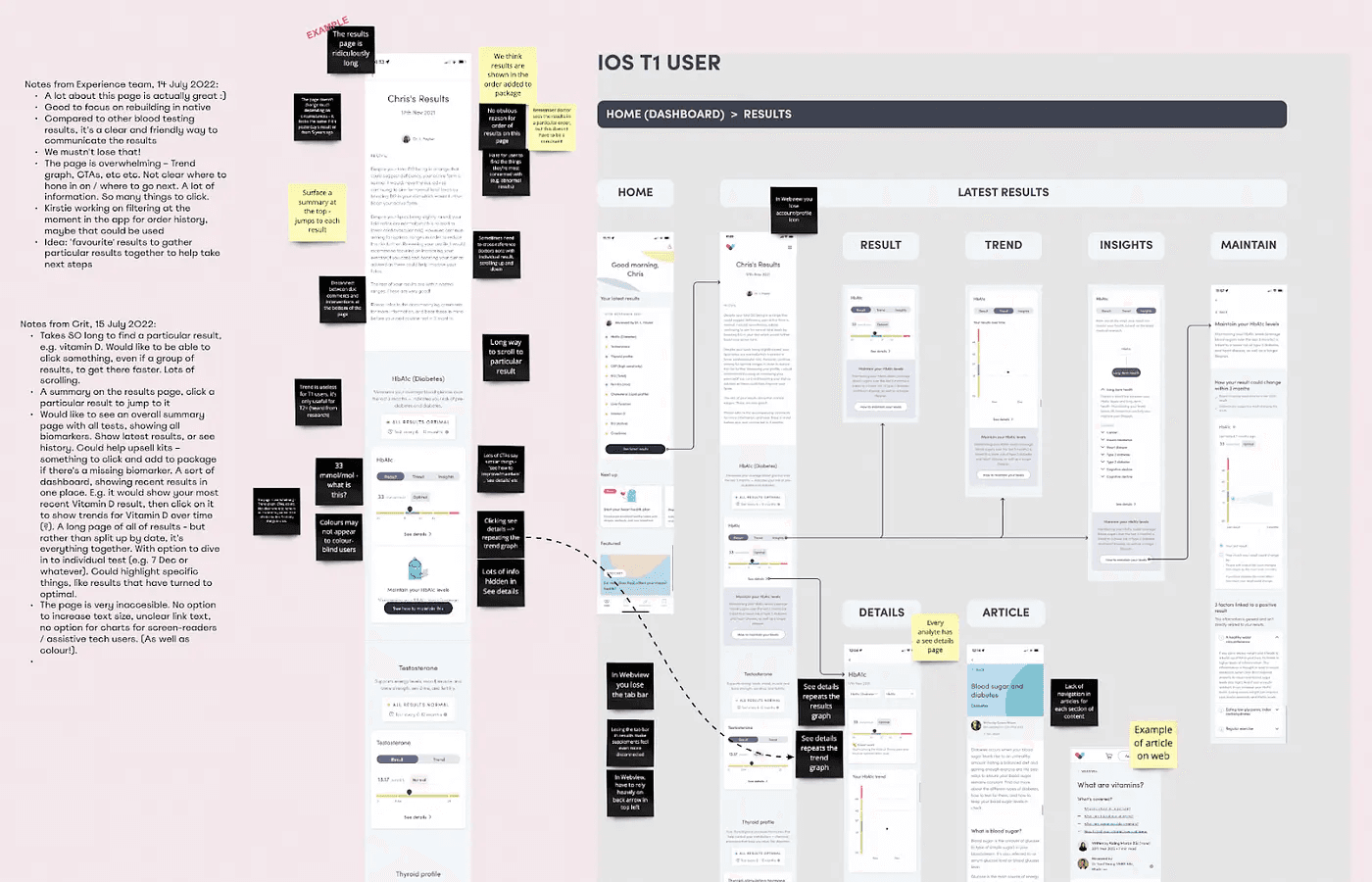
DISCOVERY
Digging into flows, data and competitors
We reviewed the current user journey and analysed the supporting data to understand where people were getting stuck or disengaging.
We mapped around 40 pain points, then prioritised them by impact × effort, emerging with a focused shortlist of challenges to tackle next.
I also hosted a competitor teardown, inviting colleagues across Thriva who used similar products to share their experiences. Together we built a Miro board filled with screenshots and journey notes from a dozen comparable services — this was an artefact that outlived this project and became a reference for other teams.
This phase clarified where the biggest opportunities lay and set the direction for our ideation sessions.
IDEATION
Ideation and wireframing, working collaboratively
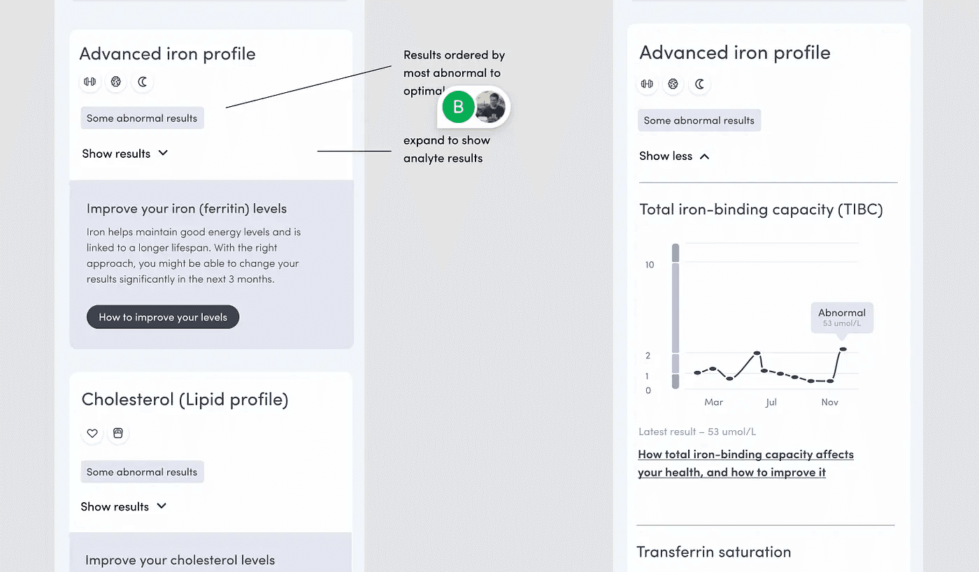
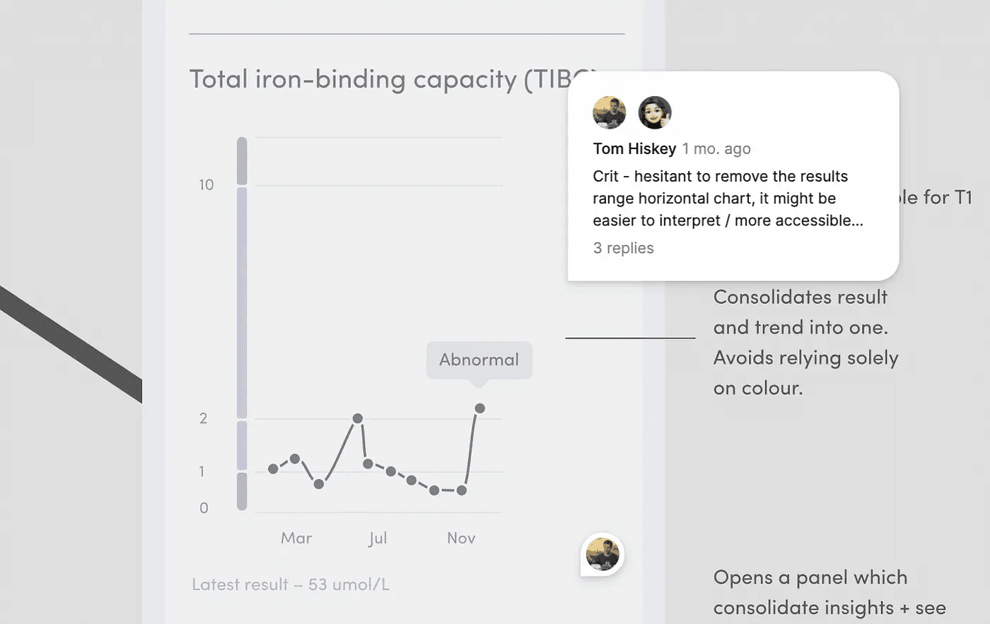
I ran a group sketching session to explore how we could make results clearer and more actionable. Noel and Macarena – doctors from Thriva’s Clinical team – contributed valuable ideas from a medical perspective. Noel proposed combining related results into a single, linked chart to show the bigger picture — it was a brilliant idea which became a central part of our solution. Seth, our tech lead, suggested reordering the page so the most important insights appeared first — helping users see meaning before data.
One of our main design challenges was simplifying routes to clinical recommendations, clarifying language, and surfacing the most relevant information at the right moment. I worked closely with Andrea, our content designer, and the Clinical team to get this balance right.
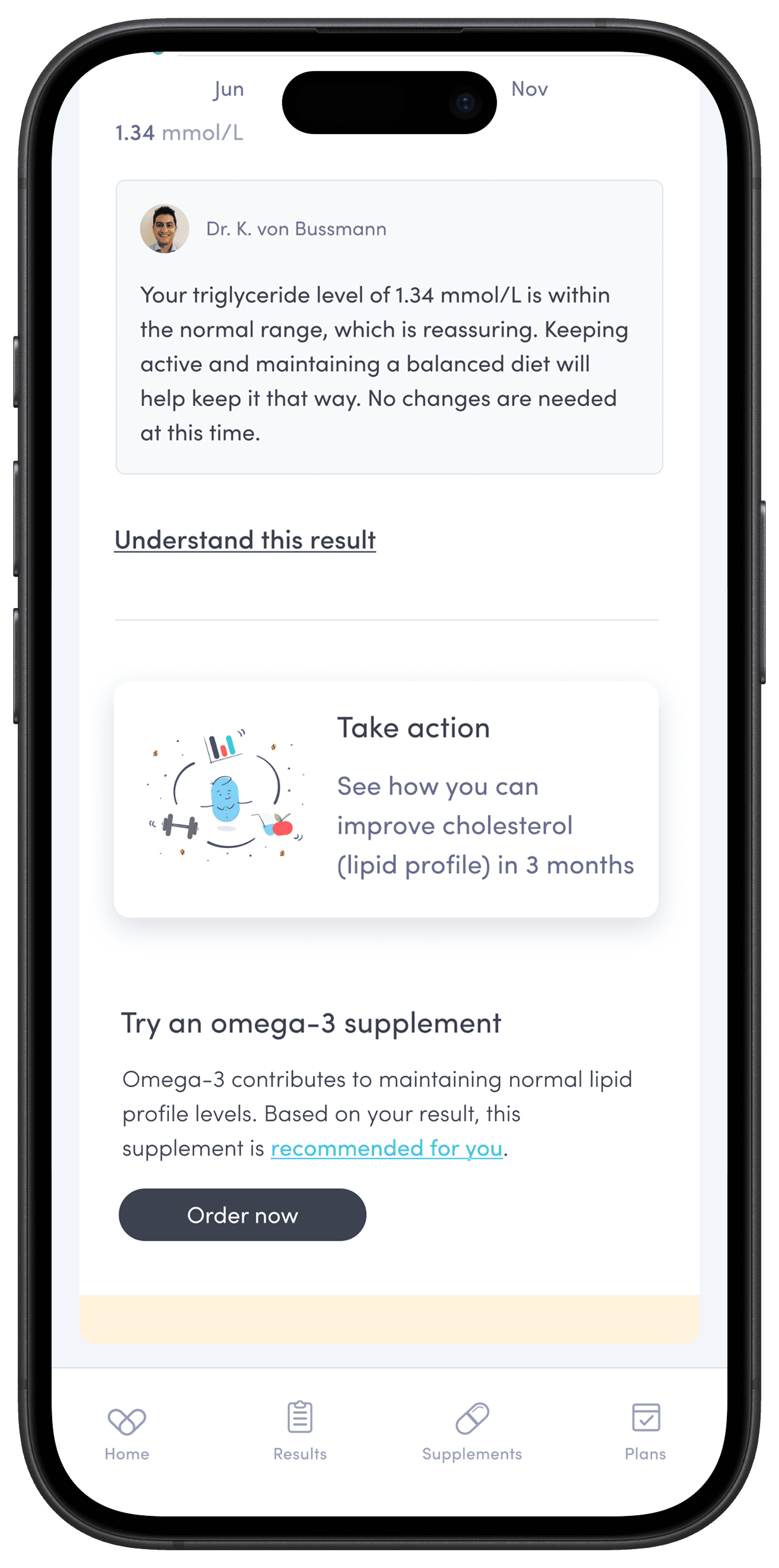
The early content shown below reflects this direction – contextual explanations such as “How to improve your iron (ferritin) levels” and “How total iron-binding capacity affects your health” bring practical guidance directly alongside the data, turning results from static numbers into actionable insights.

ACCESSIBILITY
Improving accessibility for colourblind users
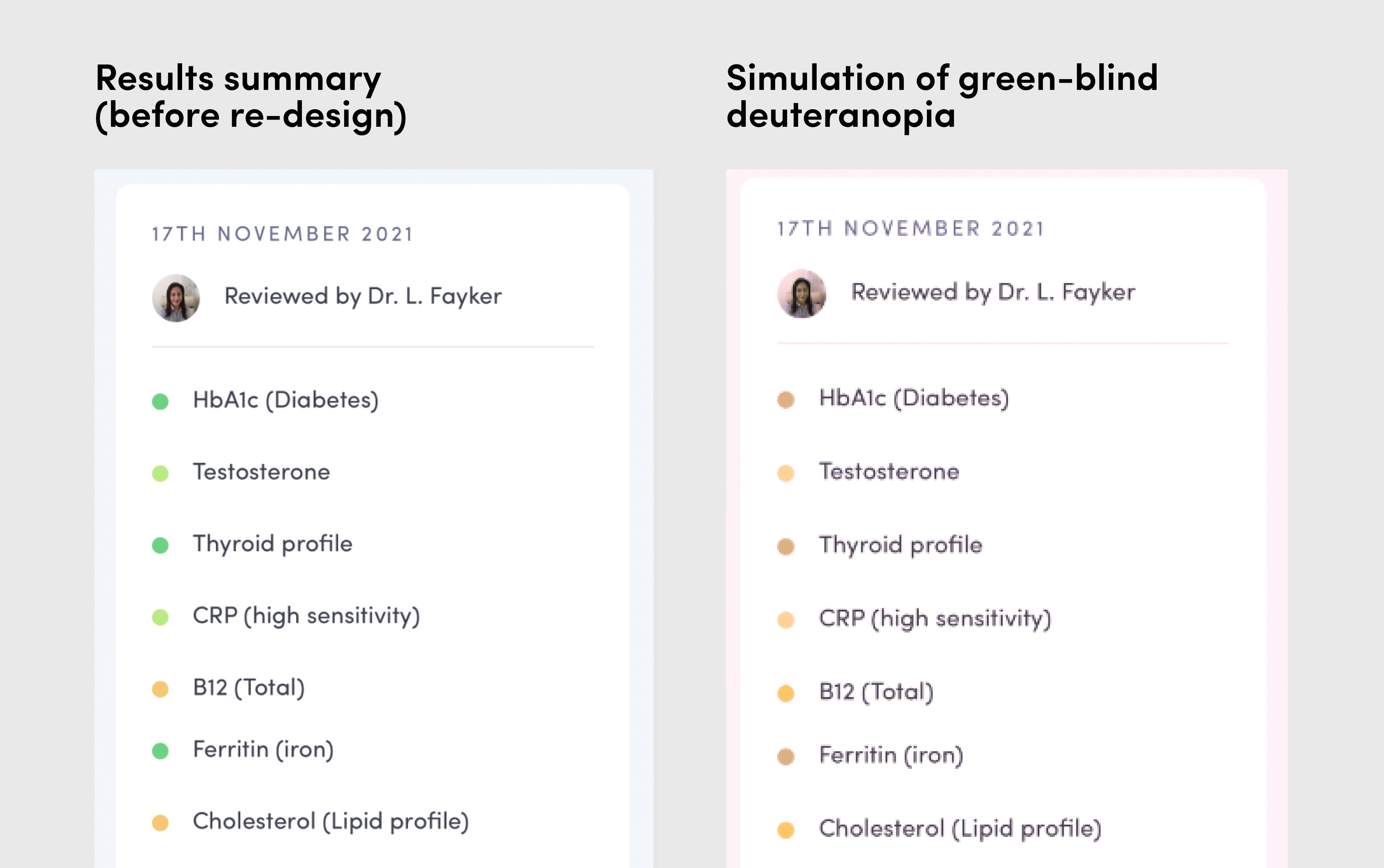
Research showed that some users – particularly those with colour-blindness – struggled to interpret the colours in the results section.
The screenshot on the left shows the original results summary. On the right is a simulation I ran to show how a colour-blind user might see it – the once-distinct series appear dull and almost identical.
This visual comparison is only helpful for non-colourblind readers of this case study – apologies to others.
These insights led me to remove colour-only indicators and introduce clear text labels and redundant cues. The redesign met the WCAG 2.1 AA standard and makes results easier for everyone to interpret, not just colour-blind users.
EVALUATIVE RESEARCH
2 rounds of user testing – moderated and unmoderated
Our user researcher Becky and I ran two rounds of evaluative testing to validate and refine our designs.
The first round, conducted via usertesting.com with non-customers, focused on usability – could people navigate the results page, interpret charts, and find next steps unaided?
The second round involved moderated interviews with Thriva users, including some with colour-blindness, to explore comprehension, tone, and real-world expectations. For each round, Becky and I worked together to prepare prototypes and scripts.
Insights from these sessions directly informed the next design iteration – for example, simplifying the chart legend and clarifying action labels – ensuring our solutions worked both logically and emotionally for users.
DELIVERY
Working alongside our engineers
I worked closely with engineers throughout implementation, holding regular design reviews and joint planning sessions to discuss design details and technical trade-offs.
This close collaboration helped surface edge cases early and ensure the experience behaved as intended across web and mobile. I often paired with Aish, one of our mobile engineers, on component behaviour. She had valuable feedback on accordion patterns which helped us refine the interactions.
We continued making small iterations during delivery, adjusting micro-copy and interactions. This tight loop between design and engineering kept quality high without slowing delivery.
FINAL UI
The redesigned results experience
The redesigned results experience made it easier for users to interpret their data, understand what it meant, and know what to do next.
Key improvements included:
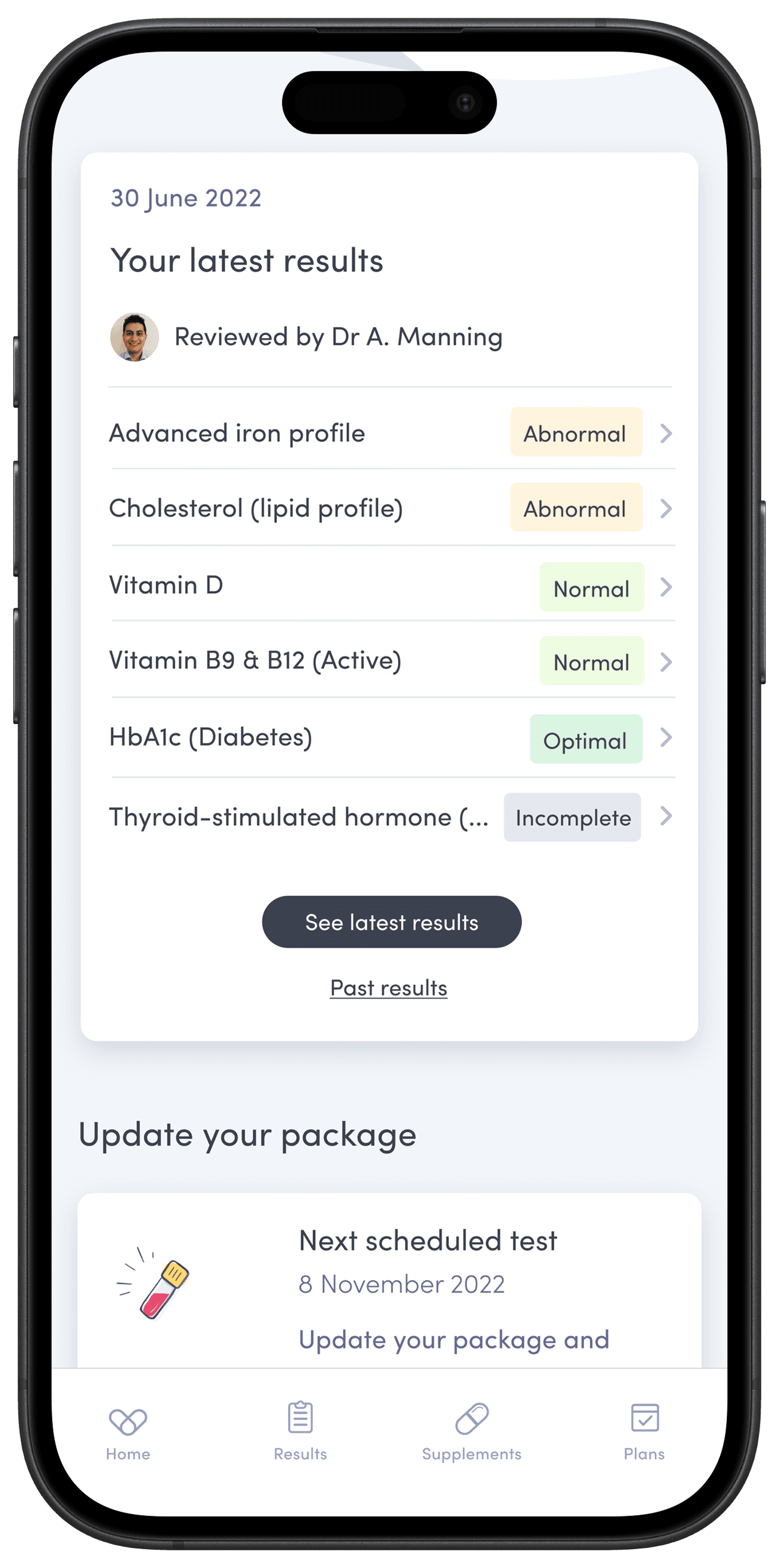
Prioritised ordering: Results are now shown from most abnormal to optimal, replacing the unclear, random ordering of the previous design.
Accessible colour system: Colour-only indicators were replaced with clear labels, improving comprehension for colour-blind users and meeting WCAG 2.1 AA standards.
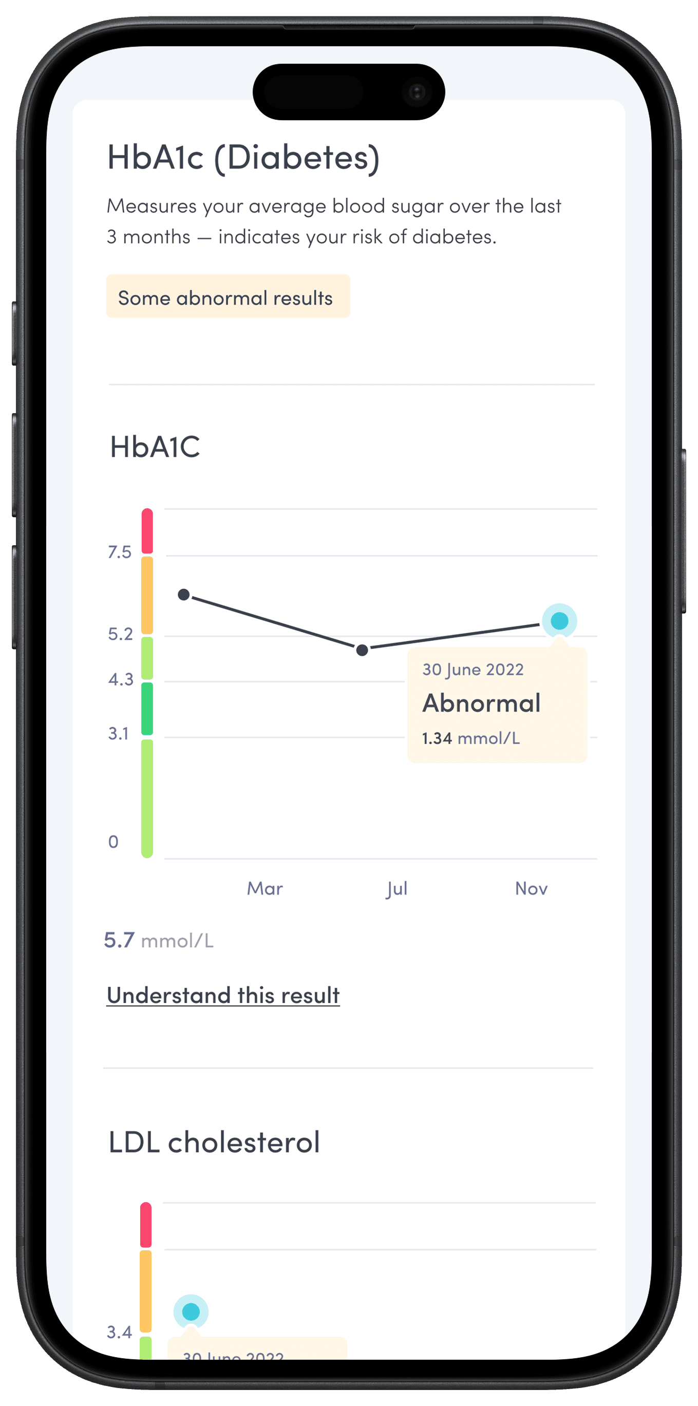
Clear, contextual charts: Visuals were refined and tested with multi-point scenarios to ensure clarity and ease of comparison.
Action-oriented design: Post-results guidance is surfaced directly on the page, giving users confident, timely next steps.
Polished interactions: Subtle micro-interactions make exploring results feel smooth and engaging.
Together, these changes turned a static results screen into an accessible, guided experience that helps users move from understanding to action.
OUTCOMES
30% drop in cancellations within 7 days of results over the 3 months after launch.
The redesigned results experience launched on time – 15 September, just 10 weeks after kick-off – as part of Thriva’s move to a fully native app.
Within three months of launch, we saw strong early signals of impact:
30% reduction in cancellations within 7 days of results among first-time users – a proxy for improved engagement and retention.
~25% increase in supplement purchases initiated from the results screen.
These outcomes suggest users were both more confident in interpreting results and more motivated to take action.
We continued tracking retention rate, our north-star metric, recognising that sustained behaviour change takes longer to measure and is influenced by multiple factors.
Overall, the project delivered measurable business impact, strengthened user trust, and laid the foundation for ongoing iteration.
Reflections
Reflections
Although early outcomes were positive, the impact on our north-star metric – retention rate – was limited in the short term. It made me question whether we could have aimed higher: using those 10 weeks to test a more radical shift in how users interact with their results, rather than an incremental improvement.
Still, the project proved to be an important foundation. It gave us accessible, structured, and measurable building blocks for later retention work – and even before launch, we’d already kicked off a follow-on project focused on improving retention.
Excellent collaboration between our 3 CRD disciplines – content, research and design – was critical to success. I wrote a blog post about how we worked together during this project.